Friday, November 28, 2008

VirtualBox's Seamless Mode in Mac OS X

So this little post will basically outline VirtualBox's seamless mode in Mac OS X. The hardware I'm using right now is a MacBook Pro with a 2.4GHz processor and 4 gigabytes of RAM.
VirtualBox is a virtualization application which lets you run another operating system inside your own. The essence of existence of this application is essentially the same as VMWare Fusion except for the fact that VirtualBox is free. Today my test consisted of testing out VirtualBox and its seamless mode, and providing a brief comparison of XP to Leopard. To enable seamless mode, you have to do the following:
1. Install or Create a virtual machine in VirtualBox for Windows XP (figure out how to do this or search Google)
2. Once Windows XP has booted up inside OS X, click on the 'Devices' context menu at the top of the screen and hit "Install Guest Additions". This will launch a program inside your XP installation. Finish the installation and click "Continue Anyway" to any driver related issues.
3. After your virtual machine has restarted, you should be able to use seamless mode! To start it, hit Machine->Seamless Mode.
The following few screenshots are aimed at providing a preview of VirtualBox's Seamless Mode's perfections and limitations:

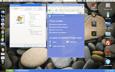
1. This is what its like to have a Windows XP and Leopard installation 2-in-1. It would be pretty amazing if that actually happened although the chances are near impossible. This screenshot shows the My Computer properties that are visible to Windows XP as a virtual machine.

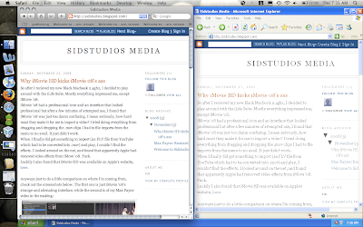
2. The screenshot below is a basic comparison of Safari vs Internet Explorer--this is as good as it could get; this is literally a 'side-by-side' comparison ;)

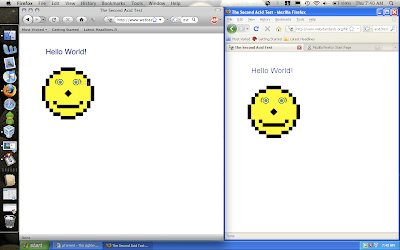
3. This is Firefox in OS X vs Firefox in Safari rendering the Acid2 test. I think its pretty neat how this side by side comparison allows you to see how efficiently the two applications use space on the screen differently.

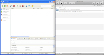
4. This is uTorrent on XP versus Transmission on OS X. We all know that uTorrent is amazing, but the UI of Transmission is just so sleek and sexy. Since my last post about uTorrent for Mac, I haven't had a chance to compare the uTorrent on Windows to uTorrent on OS X.

5. This is a basic comparison of Windows Explorer and Finder. Finder seems to have a more streamlined interface, but XPs is a lot more customizeable--you can enable viewing hidden files with the un-checking of a checkbox while in OS X, one has to use the command line and enter some arbitrary command.
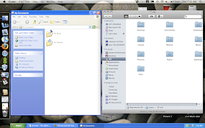

6. Another comparison of Finder and Windows Explorer--Finder surely wins here because of the special effects, but then again, Leopard IS a lot newer than Windows XP.
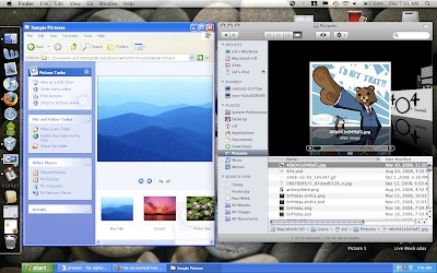

One last thing--the start bar at the bottom of the screen acts a bit funny--for some reason it never fills the whole screen from left to right.not exactly sure why, but it still works relatively well.
I hope you've enjoyed this comparison and look into getting VirtualBox and trying this out yourself. VirtualBox is available for Windows, OS X, and Linux and can run a wide array of operating systems.
Cheers.

Thursday, November 27, 2008

uTorrent for Mac Beta Overview and Screenshot Tour

uTorrent for Mac OS X is finally here! Since I use OS X, I decided to give my favorite Windows torrent client a spin...

uTorrent for OS X has a clean, consistent UI and reminds me somewhat of iTunes. It has most of the features of the Windows version of uTorrent, except for the fact that I still fail to find where or how I can add additional trackers to my torrent files.
A particularly interesting feature that is only available in the OS X version of uTorrent is the toolbar editor:

Neat, isn't it? One thing that the OS X flavour of uTorrent lacks is the toolbar theming option. I guess that this was omitted so that the UI remains beautiful--I've not actually heard of anyone that actually changes the default uTorrent Toolbar theme to date.

Anyways, on with the screenshot tour:

1. The default window for uTorrent on OS X

2. uTorrent for OS X with an example file downloading

3. uTorrent on OS X with more information about 'Peers' connected

4. uTorrent's torrent information describing files being downloaded

5. uTorrent's progress window for the torrent

6. The context menu currently available for each torrent downloading. For some reason, there is no 'advanced' button as seen on the Windows uTorrent releases, but this is probably because it is still in beta.

7. The uTorrent preferences--the UI is consistent and well done. Each of the following pictures show a different aspect of the preferences.


That's about it for now. I hope you enjoyed this overview and screenshot tour.
uTorrent for Mac looks like it will definitely improve in the future. It seems to be fairly stable for a beta release, although some have reported issues when opening .torrent files with uTorrent as Finder lags a little. If you have any updates or comments, do not hesitate to post them.
Cheers.

Monday, November 24, 2008

Why iMovie HD kicks iMovie 08's ass

So after I recieved my new Black Macbook 2.4ghz, I decided to play around with the iLife Suite. Mostly everything impressed me, except iMovie '08.
iMovie '08 had a professional icon and an interface that looked professional but after a few minutes of attempted use, I found that iMovie '08 was just too damn confusing. I mean seriously, how hard must they make it for me to import a video? I tried doing everything from dragging and dropping the .mov clips I had to file imports from the menu to no avail. It just didn't work.
When I finally did get something to import (an FLV file from YouTube which had to be converted into .mov) and play, I couldn't find the effects. I looked around on the net, and found that apparently Apple had removed video effects from iMove '08. Fuck.
Luckily I also found that iMovie HD was available on Apple's website, here.

Anyways just to do a little comparison on where I'm coming from, check out the screenshots below. The first one is just iMovie '08's strange and alienating interface, while the second is of my Max Payne video in the making:

See how strange it is? There's no real timeline, but scrolling over the video clip gives you a great preview of what you could potentially do with a bit of clipping and cutting.


Now THIS is what I call a good (basic) movie editor! You can add tracks, effects, and a lot more stuff.
Here are the video effects ALREADY INCLUDED in iMovie HD:


Besides those, there are some pretty awesome audio effects as well as included sound effects. You can add songs from your iTunes library and a lot, lot more. I haven't played around too much with iMovie '08, so I'll have to try it out a bit more and post a new article.
Until then, check out my Max Payne trailer if you already haven't.
Cheers.

Sunday, November 23, 2008

Max Payne: Remixed

So I've finally decided to publish my Max Payne trailer into a video file. I've uploaded it on YouTube, take a look below:

If you've got any suggestions on a few new mixes or ideas for future videos please post them.
Cheers for watching it!

Welcome to Sidstudios.

Cheers for visiting SidStudios. Sidstudios will now be hosted on Blogspot and all potential posts and media will be posted here.
In the future, I'll be writing about webdesign, operating systems and occasionally, I'll throw in a remixed video or a respun trailer or two. For now, I'll leave you with this introduction post. The reason I decided that using Blogger would be a better idea was that I don't necessarily need 10GB of space for one Wordpress blog. Anyways, I'll get back to this later with a Max Payne Remix trailer.

Cheers.